People view informational sites to learn. These sites are created solely to provide specific information to meet the needs of their users. But what if the user can’t easily read, navigate or comprehend the information they are viewing on the site? If this is the case, then the user won’t find what they are seeking, leaving them frustrated, which can result in the company losing users due to a lack of accessibility. This is the current problem that The National Weather Service is experiencing. Their site lacks discoverability, accessibility, visual clarity, and an uncomplicated information architecture. The end result: the company loses users’ trust and ultimately their users.
MY ROLE:
Lead designer throughout the end to end process: Research, Ideation, Design, and Testing
TEAM:
Solo Designer
TOOLS:
Figma, InVision, Miro
The Goal
Create a new site that is accessible to all, has information hierarchy, and allows for responsive design.
The Challenge
The first challenge was to create a user experience with an information hierarchy that would be simple, effective and provide clarity regarding the information being sought.
The second challenge was to work with multiple external sites housing a large quantity of data that the users were looking for when visiting the National Weather Service’s site.
The Solution
Redesign the website to be more intuitive by integrating new user interface components; making it more accessible.
Before diving into the redesign, it was vital to gain insight into what the users’ experience was like while navigating and interacting with the current National Weather Service’s (NWS) website. This would allow me to discover what pain points they might be running into.
My main questions were:
– Who are these users? – What tasks are the users trying to accomplish? – What pain points are the users encountering?
Proto Persona
Crafting a Persona: Through research, I discovered that the majority of NWS’s users were utility companies, the media, climatologists, statisticians, and general weather enthusiasts. These are people who know how to read in-depth weather data and radar reports, not your everyday citizens.
However, due to limited resources and COVID-19 restrictions, I was unable to connect with the intended user for research and interviews. Instead, I utilized resources available to me at the time: your average Jane and John Doe. If someone without in-depth knowledge of weather reports could navigate and enjoy their time on the NWS website, then the experience would also be improved for the intended user.
Based upon this research and knowledge I formulated this persona:
User Scenario:
Alex recently moved to the area. As the new Superintendent of a Chicago public school, she visits the National Weather Service (www.weather.gov) site to find reliable information to assist her planning for potential school delays/closings due to weather issues.
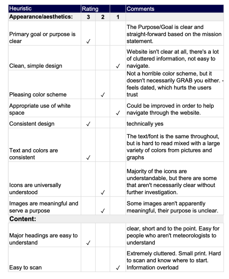
Heuristic Evaluation
Heuristic Evaluation Overview
I conducted heuristic evaluations on the six main pages that my persona would need to use in order to address her information needs.
Though the site had positive usability ratings in several areas, most of the results came back either poor or inadequate. By completing these evaluations, I discovered that the site was lacking a majority of the Universal Design Principles. Some of the missing principles included user control and freedom, flexibility and efficiency of use, as well as an aesthetic and minimalist design. These principles help users recognize, diagnose and recover from errors, as well as with visibility of system status.
Heuristic Evaluation
Heuristic Evaluation Overview
I conducted heuristic evaluations on the six main pages that my persona would need to use in order to address her information needs.
Though the site had positive usability ratings in several areas, most of the results came back either poor or inadequate. By completing these evaluations, I discovered that the site was lacking a majority of the Universal Design Principles. Some of the missing principles included user control and freedom, flexibility and efficiency of use, as well as an aesthetic and minimalist design. These principles help users recognize, diagnose and recover from errors, as well as assist them with the visibility of the system’s status.
Accessibility Analysis
I conducted accessibility tests using https://accessible-colors.com to determine how visually accessible the original site was for the user. To my surprise, the majority of the site passed.
However, there were certain pages and areas, such as banners, within the site that did not pass.
Usability Testing
After the initial heuristic evaluation, I conducted usability testing to better understand the user’s main needs and to identify what pain points they experienced using the original site’s design. To get started, I created a user research plan that allowed me to outline my research goals and target audience criteria.
I was then able to test and take notes on 5 participants that fit this criteria.
Tasks
User Feedback
01
Using weather.gov, describe where you would navigate to in order to learn what kind of information the website provides and what it can be used for
“It was difficult to find as it wasn’t where most search bars are usually found, and the text is really small.”
– Cheyenne
02
Find all the ways that you can discover what the forecast is in your local area
“Oh, that didn’t do what I thought it was going to do.”
– Ben
03
Locate safety tips on what to do when it’s extremely cold outside
“Oh, I did it.. somehow… um I think. Not sure how I got here.”
– Megan
User Feedback
“It was difficult to find as it wasn’t where most search bars are usually found, and the text is really small.”
– Cheyenne
“Oh, that didn’t do what I thought it was going to do.”
– Ben
“Oh, I did it.. somehow… um I think. Not sure how I got here.”
– Megan
Pain Points
I discovered that many of the pain points occurred when simply navigating the site. Some of the pain points were:
Endless amount of options/ routes to get to pages with little to no guidance to indicate if it was where the user needed to go to accomplish their goals
Links navigating the user to external sites without communicating to them they were about to leave the NWS.com. Many users couldn’t figure out how to get back to home
Duplicate navigation tabs/links that took the user to completely different pages from one another, leaving the user confused as to where they needed to be
Cognitive overload due to the site’s cluttered and chaotic page layouts
2×2 Matrix
What’s important to the user & the agency?
After the usability tests were conducted, I examined my findings, in order to analyze what the major pain points were. With this information, I was able to determine what was most important to both the user and the government agency. With these findings, I could prioritize my next steps.
Redline Annotations
Redlining the current site allowed me to take apart the pages in smaller bites to analyze them more efficiently. This laid the groundwork for my website redesign.
Not enough white space, and the white space that is currently on the page was not purposefully placed or laid out. Needs more breathing room on the pages.
You have to click on the search tab before you are able to see and type in the search box. There is also a second search box located to the left of the page, but it seems as though that’s only for searching locations for weather forecasts.
One of the very first things that I observed with my users was how overwhelmed they were when they tried to interact with the Weather.gov navigation. In fact, many tried to navigate the site without having to use the navigation menus.
My goal was to zero in on how the navigation site was organized, including word selection for the titles, and to study what my users’ pain points were. This resulted in a brand new navigation system for the site.
Sitemap Redesign
The Problem within the Problem
The National Weather Service’s website is crowded with duplicated navigation items, some of which don’t link to an active page. The website is text heavy with extremely small font. This gives the user an overwhelming and disoriented feeling while navigating through the site. Some users mentioned they would have left the site within minutes due to the aforementioned issues.
My Approach
Removing duplicative and/or nonessential items, and reorganizing those that are critical will result in a less cluttered navigation system and therefore a better, more intuitive, experience for the user.
Moodboard
Before diving too deep into the redesign of the site, I wanted to be sure the direction I was going in was one that would improve the user’s experience. It was important to keep the site professional but to also bring a refreshing lift to it.
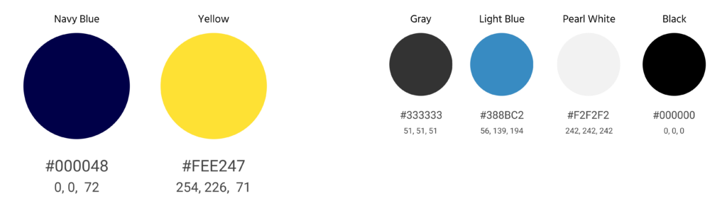
The dark blue would keep the government feeling, while the yellows and greens would breathe life into it.
Many users noted the site’s old branding did not instill trust in the data as the site looked and felt outdated.
Moodboard
Before diving too deep into the redesign of the site, I wanted to be sure the direction I was going in was one that would improve the user’s experience. It was important to keep the site professional but to also bring a refreshing lift to it.
The dark blue would keep the government feeling, while the yellows and greens would breathe life into it.
Many users noted the site’s old branding did not instill trust in the data as the site looked and felt outdated.
By leveraging user feedback, I created low-fidelity wireframes that allowed me to visually determine the best content structure to implement prior to applying visual design.
Above the Fold
Content placement is important.
When a user navigated to the original weather.gov’s home page they were presented with information that was crammed together, providing the user nil to little direction. Many users assumed the map placed above the fold was important in some way, but couldn’t figure out why or how to use it since the essential map key was placed below the fold.
This was the first item I addressed in my redesign wireframes.
Information Architecture & Discoverability
It was important to add organization to the structural design of the site, with the intent to arrange the navigation in a way that was understandable to the user. This would allow better functionality of the site and therefore create a better experience.
I added visual indicators, underlined and bolded navigation items, and incorporated a hover state for the sub-navigation, to communicate to the user where they were on the site.
Extensive Amount of Information
An advantage and disadvantage to this site is the abundant amount of data and information available. Not only did the site have primary, secondary, and sub-navigation it also had a mega footer.
To help alleviate anxiety for the user, I designed a primary and secondary footer. This feature organizes access to the information in a more manageable and digestible format.
The information presented in the primary footer is content most frequently accessed by users, while the information in the secondary footer (visible by expanding the section down) is more detailed for specific searches.
5 Second Test
To make sure my design effectively communicated the intended message and information to the users, I conducted several 5 second tests. This allowed me to learn what the user’s first impressions were with the new pages.
Style Tile & Guide
The aesthetics of the original Weather.gov website were basic and outdated. At least 80% of the users that were interviewed said they would have opted out of using the site as it felt antiquated, and questioned the reliability of the information. Creating a new style and brand will breathe life back into the site, provide better direction, and instill trust for the user again.
Before diving into the style guide I created a style tile to plot ideas visually for myself.
The National Weather Service is a data-driven site, and therefore most visitors will be viewing the site from a desktop. However, since over half of online traffic comes from mobile users I felt it was important to make the site responsive for all devices.
Usability Test
The Goal
The main goal of the test was to confirm that the information architecture redesign was executed in a way that was helpful and intuitive to the user. The objective was to give the user a clear direction to content and make the process accessible, clear, findable, usable, and learnable.
Results
In addition to improved usability, each user found the new site to be more credible, which was one of the biggest challenges with the old design.
User Feedback
“It’s pretty easy to read and navigate, and should be easy to use.”
– Megan
“It’s easy to navigate around, easy to find your starting point, and there are several options to get to the information you’re looking for.”
– Andrew
“I like the dropdown aspect of this.”
– Bryan
Usability Test
The Goal
The main goal of the test was to confirm that the information architecture redesign was executed in a way that was helpful and intuitive to the user. The objective was to give the user a clear direction to content and make the process accessible, clear, findable, usable, and learnable.
Results
In addition to improved usability, each user found the new site to be more credible, which was one of the biggest challenges with the old design.
User Feedback
“It’s pretty easy to read and navigate, and should be easy to use.”
– Megan
“It’s easy to navigate around, easy to find your starting point, and there are several options to get to the information you’re looking for.”
The National Weather Service (NWS) redesign was a fascinating project. I learned how design can play a key role in whether or not users view a site as trustworthy and the importance of good architecture.
The biggest challenge that I faced was working with limited resources and constraints caused by COVID-19. However, with the resources that I did have access to I was able to create a new site for NWS, one that enhanced the experience for its users and instilled trust back in them.
Reflection
This project pushed me to think about the responsive behavior of a data/ information-heavy website and how a user might interact with it on devices having various screen sizes.
I also learned the importance of communication with colleagues as new information is added to a large site over time. Without a well-established information architecture, a site can become disjointed and cluttered quickly, leaving the user confused and lost, hesitant to return.
Looking Forward
Items I would address if able to continue to work on this project:
I would love to gain access to true users that utilize the National Weather Service’s site, such as the media, energy companies, climatologists, and statisticians. This would allow me to:
Understand how users interact with the vast variety of interactive graphs that are currently on the site
Incorporate real-life users’ ideas and creative challenges to improve information, usability and content delivery, to ensure the site is fresh and innovative as technology changes
Dive deeper into the user experience on mobile and research what the percentage of use is, adapt to meet greatest needs.
Research and understand what content is being used on the site; if there is any content not being used. Why? Are users not able to find it? Do they not find it useful? Being able to trim and shape the website could potentially benefit both the user and the agency.